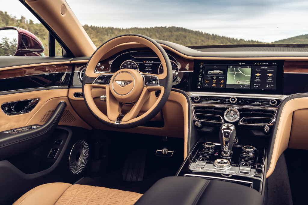
Graeme Smith and his team of Human Machine Interface (HMI) designers at Bentley have created a mood board of icons, colors and images that will appear in its Flying Spur and Continental GT models. One key decision was whether to make the graphics skeuomorphic – a 3D graphic representation of a physical object – or a flat digital design.
Graeme says, “A Bentley isn’t a smartphone; it’s going to be used and cherished for generations. So we chose a skeuomorphic approach that will age with the car. Look at pure digital instrument graphics from ten years ago – they’ve dated faster than the car they were part of.”
Director of design, Stefan Sielaff, adds, “In general, skeuomorphism is being phased out in favor of a clear and flat graphic communication of information. But we were quite clear about not going all the way to this kind of ultra-modern digital graphic. It would have been wrong for the brand and for the car. We still use skeuomorphism, dials and needles, to convey the traditional way of getting this kind of information.”
One of Bentley’s latest digital design innovations is the new dim screen mode, for times when you don’t need any navigation or infotainment to distract you from the road ahead. Just the bare minimum of information is displayed, fuel gauge and engine temperature, time, speed and outdoor temperature. Even the speedometer and rev counter dials are in darkness – except for a soft pool of light around the point of each needle.
Both the Continental GT and Flying Spur have the same driver instrumentation, but there are subtle differences in the design. Working with Bentley designers Brett Boydell and David Leary, Graeme’s team introduced a new element for the Flying Spur in the form of a bronze chapter ring around both the speedometer and the rev counter.
Brett says, “We introduced the bronze chaplets to give a consistent feel between the physical and digital detailing. The design reflects the refinement and luxury of the Flying Spur, whilst still being a precision instrument appropriate to such a high-performance vehicle.”
Where the Continental GT’s dials feature a 3D-effect to the background knurling, reflecting the design of that model’s distinctive gear lever, the Flying Spur’s dial has an outer ‘machined’ disc where the numerals sit. Both designs complement tangible design elements within the cabin; the Continental GT’s design is clearly performance focused, while the dials of the Flying Spur convey a hint more formality.
Once the design is approved, next comes the task of translating it into every menu, operation and screen. For the central display in the Flying Spur, that meant designing around 600 different icons and over 1,500 menu screens. There were the different alphabets and page orientations of English, Russian, Arabic and Chinese to incorporate, and text for 27 different languages to translate and accommodate within the screen layouts.
Graphics that relate to proprietary systems or icons, like Sirius radio in the US or Apple CarPlay, must be signed off by those companies. There are three different audio systems – Bentley, Bang & Olufsen and Naim – all with their own graphic interface. The Human Machine Interface team at Bentley includes three graphic designers and nine ‘function owners’ who each take responsibility for a specific infotainment area, from audio to climate. 


