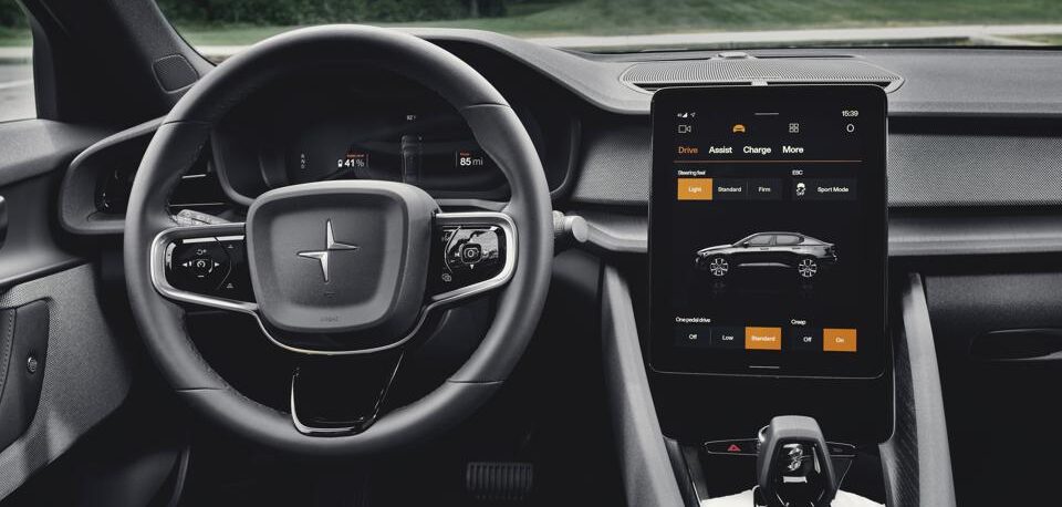
A new UX evaluation from Strategy Analytics, a specialist in lifecycle planning for companies, conducted by its In-Vehicle UX (IVX) group, has assessed the Polestar 2 infotainment system and relevant HMI.
The assessment found that the Polestar 2 infotainment designers managed to create a new benchmark in automotive infotainment by implementing embedded Google-powered features with minor adjustments specifically for in-car use. Comparable to the premium systems from Tesla and BMW, the Polestar 2 is deemed to be a success, however, the assessment notes that in certain use cases, aesthetics have taken priority over functionality.
Overall, Polestar 2’s infotainment system was ranked solidly in the top tier of all vehicles evaluated thus far using Strategy Analytics’ proprietary infotainment benchmark algorithm – a ranking system derived from how well a car’s available features correspond to Strategy Analytics’ existing data on consumer interest in advanced infotainment features.
Derek Viita, senior analyst, IVX, and report author, commented, “With the expansions of Android Automotive and Google Automotive Services throughout the space, auto makers have anxiously awaited the arrival of the Polestar 2 as a forerunner of things to come. And it does not disappoint: the satnav and voice experiences alone make Polestar 2 extremely formidable.
“But for certain in-vehicle use cases, aesthetics has been prioritized over usefulness. The log-in and authentication process necessary to unlock the full power of the Google experience is lengthy, complex and unlikely to be completed by those simply renting or leasing the vehicle. Touch targets and labels for some features are entirely too small for an in-car screen and Android-centric design language runs the risk of unintentionally excluding some users. And as Strategy Analytics has noted previously, though dedicated controls for defoggers are good practice, the placement of most climate controls in the touchscreen is troubling.”


